
Last modified: 2025-11-01 by antónio martins
Keywords: são miguel | saint michael | stars: 10 (yellow) | chain (green) | chain: 4 links | tree | scales | waves |
Links: FOTW homepage |
search |
disclaimer and copyright |
write us |
mirrors
![[flag]](../images/c/cv-76.gif)
image by António Martins, 14 Nov 2017
See also:
External links:
Photos
of athletes running in
2017 under the municipal banner (literally; the
others
show allegiance to clubs) show that the flag is white with centered
emblem. The ratio seems to be around 5:7, less oblong
than most (~3:2) and even less than the national
flag
António Martins, 14 Nov 2017
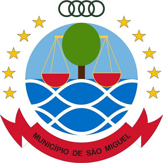
![[emblem]](../images/c/cv-76).gif)
image by António Martins, 07 Jul 2017
The municipal emblem of São Miguel features the usual twofold arch
of ten golden stars with a
chain segment on its apical gap, in this case
made of four green links. As usual, this arrangement surrounds the upper
part of the emblem while the lower is surrounded by a stylized scroll, in
this case red with white underside and black letters. These are black
serifless capitals and read "MUNICÍPIO DE SÃO MIGUEL".
The main element of the emblem (its shield, when seen as a coat of
arms), is, as usual, round, and features a tree whence a scales hangs
above wavy waters against a sky background. The scales are red with
golden edging, the tree is naïf/stylized to a light green elipsis
atop a brown rectangle, all on a background horizontally divided in two
halves: Lighter blue above light blue, the latter patterned with thick
white sinusoidal lines.
António Martins, 07 Jul 2017
According to
this
offtopic blogpost in an anonymous foodie weblog, the municipal
emblems of São Miguel
(image)
and São Lourenço dos Órgãos
(image)
were both created by the same designer (the annonymous foodie hirself).
António Martins, 07 Jul 2017
Anything below this line was not added by the editor of this page.