
Last modified: 2022-03-05 by ian macdonald
Keywords: parana | são pedro do iguaçu |
Links: FOTW homepage |
search |
disclaimer and copyright |
write us |
mirrors
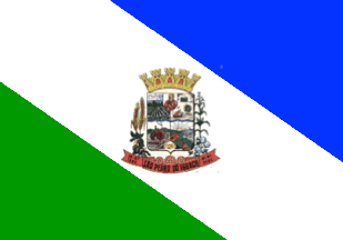 image by Ivan Sache, 9 February 2022
The municipality of São Pedro do Iguaçu (6,492 inhabitants in 2010; 30,833
ha) is located 570 km west of Curitiba.
São Pedro do Iguaçu was
established in the 1960s by Benthein & Cia Ltda started the sale of properties
to Banco do Estado do Paraná S/A ñ Banestado, owner of a considerable area,
through bonds issued by the State. On 29 June 1963, St. Peter's day, a man named
Donato built the first hut and coined the name of the new settlement for St.
Peter.
The district of São Pedro was established by Municipal Law No. 571
promulgated on 23 October 1970, to be elevated a municipality by State Law No.
9,336 promulgated on 16 July 1990. The name of the new municipality was selected
among three proposals, São Pedro do Oeste, São Pedro do Paraná and São Pedro do
Iguaçu.
http://saopedrodoiguacu.pr.gov.br/
Municipal website
The flag of the municipality of São Pedro do Iguaçu was designed by heraldist
and vexillologist Reynaldo Valaski, as follows.
a) The municipal flag shall
be rectangular, in proportions 14 units in width on 20 units in length, pursuant
Article 5 of Federal Law No. 5,700 promulgated on 1 January 1971.
b) The flag
of the municipality of São Pedro do Iguaçu is composed of a white (silver)
stripe in the center of the rectangle and two isosceles triangles in equal
dimensions in blue (azure) and green (vert).
I ñ The blue (azure) isosceles
triangle in the upper part of the rectangle symbolizes the firmament, the
beautiful veil of Our Lady covering the entire territorial area of the
municipality, heraldically symbolizing justice, truth, loyalty and beauty.
II
ñ The white (argent) stripe in the center of the rectangle represents pure
light, is the symbol of peace, friendship, work, prosperity, purity and
religious spirit.
III ñ The green (vert) isosceles triangle in the lower part
of the rectangle denotes faith, symbolizes the forests, the fields, the rich
agricultural areas of the municipal territory, the freedom, the strength and the
hope of all the people of the municipality of São Pedro do Iguaçu.
The
coat of arms of the municipality of São Pedro do Iguaçu was designed by
heraldist and vexillologist Reynaldo Valaski, as follows.
A classical
Flemish-Iberian shield surmounted by a yellow (or) eight-towered mural crown
illuminated in red (gules). A field bordered black (sable)divided into four
quarters, an escutcheon and an irregular triangle, a sinuous horizontal line in
the center, on the right (dexter) and on the left (sinister) plants proper,
gears, a red (gules) scroll containing the toponym "São Pedro do Iguaçu" and in
chronological abbreviations dexter "16ñ07ñ1990" and sinister "01ñ01ñ1993".
The description of the coat of arms in terms of heraldry has the following
symbolic interpretation.
I - The classical Flemish Iberian shield used to
represent the arms of São Pedro do Iguaçu originates from Germany, introduced in
the Iberian peninsula during the fights against the Moors, starting to appear in
Portuguese armorial, notably in domains' heraldry, being this style inherited in
Brazilian heraldry, as evocative of the colonizing race and main builder of the
nation.
II - The mural crown that surmounts it is the universal symbol of
domains' coats of arms; yellow (or) with eight towers, only five of them visible
in perspective drawing, it classifies a 3rd rank town, that is, the seat of a
municipality. The red (gules) illumination is consistent with the attributes of
pioneers and community leaders.
III ñ The first, right quarter features
beautiful green (vert) forests, signs of deforestation for plantation,
symbolizing the beginning of colonization and formation of today's municipality
of São Pedro do Iguaçu.
IV - The second, right quarter features a classroom,
a map of the state of Paraná, a terrestrial globe, books and a pen symbolizing
education and culture of the municipality's people.
V ñ The escutcheon
features the municipality's patron saint, St. Peter.
VI ñ The blue (azure)
horizontal, sinuous line symbolizes rivers Santa Quitéria and São Francisco
Falso, streams Arapongas and Apepu, and brooks Separação and Vital Brazil, which
irrigate the fertile lands of São Pedro.
VII ñ The green color (vert) is the
symbol of hope, freedom and strength while the blue color (azure) symbolizes
nobleness, justice, perseverance, zeal, loyalty, recreation and beauty.
VIII
- The lower, right quarter features a beautiful area of land, with a tractor
being driven by a countryman, cultivating the rich and fertile lands of the
municipal territory, symbolizing the areas with mechanized cultures of the
municipality.
IX - The central, left quarter features the sun, beautiful
plains, a pig's head, part of a bull, symbolizing pig breeding and
cattle-breeding, below, poultry birds symbolizing aviculture, all sources of
income for the Municipality.
X ñ The triangle features a handshake
symbolizing the union of the constituted powers of the municipality with its
people.
XI ñ The shield is supported right by wheat and soybeans, by left
cotton and corn, all fructed proper, emphasizing the fertility of the generous
soil of the municipality of São Pedro do Iguaçu as important products offered by
fieldwork.
XII ñ The color yellow (or) is the image of maturity of judgment,
representing nobleness, greatness and wealth, symbols of glory, splendor and
sovereignty; brown symbolizes earth, vigor and honesty; white symbolizes pure
light, integrity, obedience, vigilance, peace and order; the black line that
surrounds the shield symbolizes prudence, moderation, austerity and firmness.
XIII ñ The gears above the scroll symbolize industry and represent the perfect
interplay that exists between farming and commerce, since they are the two main
sources of income and growth of the municipality.
XIV ñ The red (gules)
scroll contains in the center the toponym "São Pedro do Iguaçu", on the right
the chronological abbreviation 0"7-16-90", date of the creation of the
municipality, and the chronological abbreviation "01-01-1993", solemn date of
the political and administrative emancipation of the municipality of São Pedro
do Iguaçu; red (gules) symbolizes strength, courage and triumph.
http://saopedrodoiguacu.pr.gov.br/uploads/pagina/arquivos/Descricao-dos-Simbolos-Municipais.pdf
Municipal website
Photos
https://www.facebook.com/Prefeitura.spi/photos/719248108112238
https://www.facebook.com/Prefeitura.spi/photos/719246431445739
Ivan Sache, 9 February 2022