Last modified: 2026-08-15 by  zachary harden
Keywords: worlds fair | bureau international des expositions | bie | world fair |
Links: FOTW homepage |
search |
disclaimer and copyright |
write us |
mirrors
![[Bureau International des Expositions]](../images/i/int-bie.gif)
image by Zachary Harden, 18 July 2022
See also:
![[Bureau International des Expositions]](../images/i/int-bie2.gif)
Source; image by Zachary Harden, 10 October 2023
The BIE, the Bureau International des Expositions, is the international body that sanctions international expositions
(world's fairs). It consists of the BIE logo in blue on a white field. The logo was created by a Japanese student in 1969.
It is flown at all sanctioned world's fairs. I do not know if there is an official
height-to-width ratio.
Urso S. A. Chappell, 3 January 2002
The world's fair flag was created for Expo'70 in Osaka. It is white with the BIE symbol in the middle. At most closing
ceremonies these days it is pass to the next host city something like the
Olympic flag. Many individual expos have had their own flags as well - for the most part these have also
been white with the each expo's symbol in the middle. The earliest flag
I've seen is from New York 1939.
Mike Kuna, 25 May 2002
It seems the below flag was used at the 2010 Expo in Shanghai, China, but in the expo being held in Osaka, Japan, in 2025, the pre-2010 flag has been readopted. This flag was seen at the 2020 Expo in Dubai, UAE.
Zachary Harden, 18 July 2022
![[Bureau International des Expositions]](../images/i/int-bie_cn.gif)
image by Zoltan Horvath, 5 July 2010
The new flag, based on the organization's website has a smaller logo that
previously, with a shining effect, and the text Bureau
International des Expositions" written around the hoist side, in green (B, I,
Expo) and blue (remaining letters).
Zoltan Horvath, 5 July 2010
![[Bureau International des Expositions]](../images/i/int-bie).gif)
image located by Esteban Rivera, 31 July 2026
"A proposal (for a logo was) made during the preparations for Expo 1970 Osaka. On June 11, 1968, Vice President "吉丸 寛" (English: Yoshimaru Kanno) suggested creating a unified World Exposition Emblem and flag at a meeting of directors of departments and offices. This emblem and flag were envisioned to be akin to the Olympic Flag ( https://www.crwflags.com/fotw/flags/oly@ioc.html ), symbolizing international cooperation and to be passed on to future host countries.
Kanno's proposal received support from Joseph Hamels, Vice President of the Bureau International des Expositions (BIE). The proposal was formally adopted by the BIE's Bulletin and Publicity Committee on October 29, 1968, and subsequently approved at the 64th BIE Directors' meeting on November 29, 1968.
Each country was asked to submit three design proposals to the BIE Publicity Committee in Paris who would make the final decision.
"勝江勝" (English: Masaru Katzumie), who was working as a design adviser to the Association, was asked to serve as chairman of the selection committee. Katzumie had experience working with selection committees. He had overseen the design of symbols for Expo '70 and the Meiji Centenary, and would later go on to manage those of the Sapporo Winter Olympic Games ( https://www.crwflags.com/fotw/flags/oly@w11.html ) and Expo ‘75 in Okinawa.
To create the emblem and flag before Expo 1970 Osaka, the BIE called upon its 34 member countries to solicit designs through national competitions. In Japan, a public competition was organized by the Ministry of Foreign Affairs (official website: http://www.mofa.go.jp/ ), the "通商産業省" (English: Ministry of International Trade and Industry) (1949-2001, merged with other institutions to create the "経済産業省" (English: Ministry of Economy, Trade and Industry) (official website: https://www.meti.go.jp/ )), and the "財団法人日本万国博覧会協会" (English: Japan World Exposition Association) which was the Association for the 1970 World Exposition, with support from various local organizations. The competition received 44,628 designs with one top design and five honourable mentions were selected, and the top three were sent to Paris from 13,389 participants.
After rigorous screening, the joint design by "上田広義" (English: Hiroyoshi Ueda) and "古村修" (English: Osamu Furumura) (other sources mention "古村 真" (English: Furumura Makoto)) won the first prize in Japan, with other notable designs receiving citations, namely one logo of interlinked figures by "沢村透" (English: Tooru Sawamura) and a globe intersected by lines forming a raised pyramid by "松島正則" (English: Masanori Matsushima).
During the final selection at the BIE, the design by Masanori Matsushima, a senior student at the "東京教育大学" (English: Tokyo University of Education, currently the University of Tsukuba (National) ( https://www.crwflags.com/fotw/flags/jp_tkbu.html )), was chosen (in 1972) as the official World Exposition Emblem.
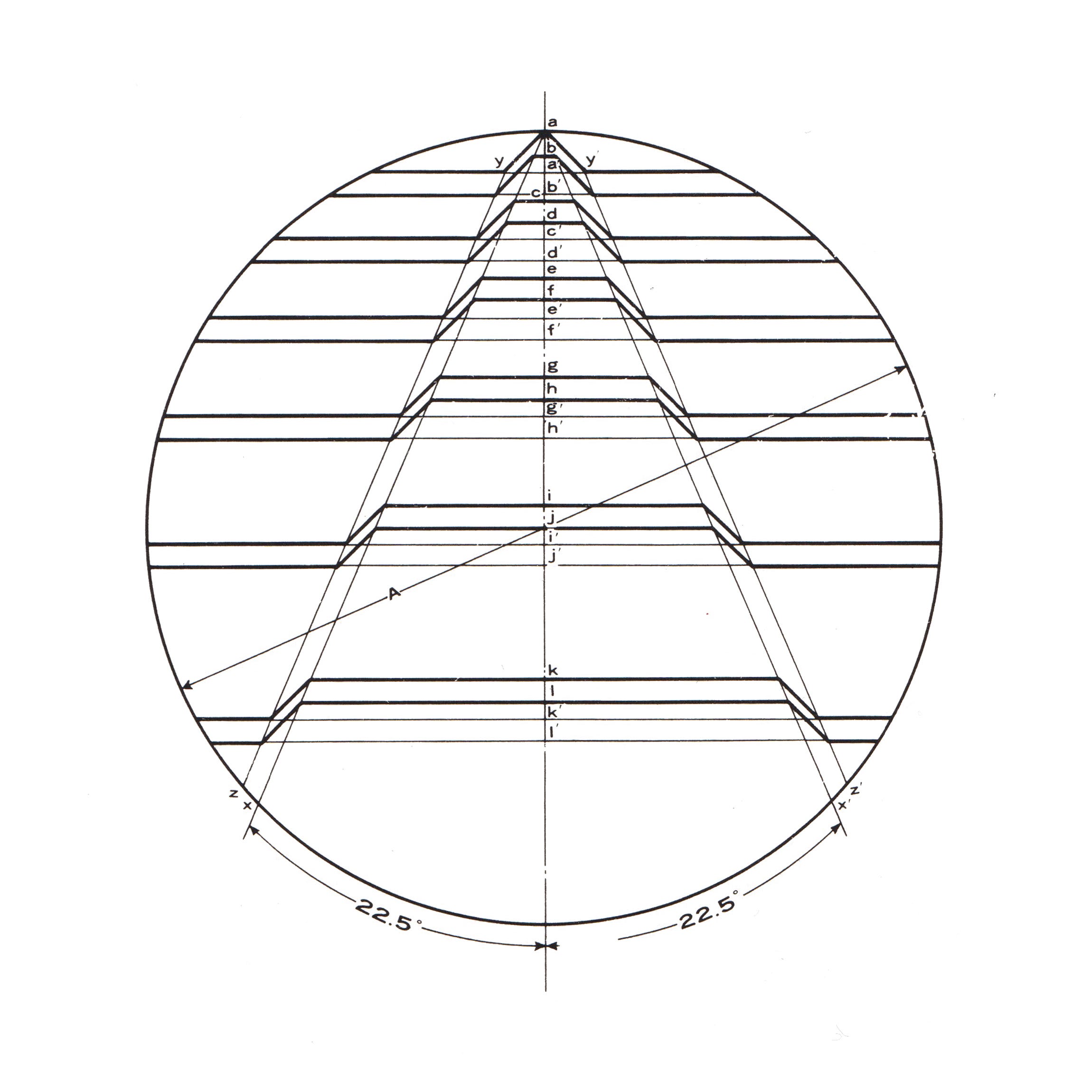
Masanori Matsushima's design features a circle symbolizing peace, fraternity, and cultural exchange, while the horizontal lines represent steps leading to a future of boundless progress. The six lines forming an ascending arrow indicate progress, with the purple-blue color symbolizing nobility in Japan, the vast oceans, and the skies, evoking a sense of the cosmos. The white lines represent peace and justice."
Sources: https://fr.linkedin.com/company/bureau-international-des-expositions , https://www.expomuseum.com/bie-flag-emblem and https://www.logohistories.com/p/bureau-international-des-expositions-logo-1970s
Esteban Rivera, 31 July 2026